If you’re a business owner who can talk about the benefits of your product all day, but you struggle when it comes to creating polished, professional-looking graphics on social media, this blog is for you.
Maybe you know when your design looks off, but you may not have the vocabulary to explain or pinpoint why. Knowing the basic principles can help you identify what is missing in your designs so that you can create work you are confident in.
As a social media content creator for KWSM, I can tell you that the job requires wearing many hats. Creating quality social content for my clients requires knowledge in a variety of areas, one of those being graphic design. I developed my graphic design skills by working closely with our talented KWSM design team and I use what I’ve learned regularly to elevate my content.
“Content creators have the opportunity to connect with their audience through their social content. A huge amount of psychology goes into design, so knowing fundamental design principles helps you communicate with and guide your target audience more effectively.”
-Madeleine Wood, Web Designer, KWSM
Whether I’m creating a graphic for Facebook or a scroll-stopping thumbnail for a reel on Instagram, having basic knowledge of the principles of design improves my work and gives it that professional look and feel. I created this beginner’s guide to graphic design so you can do the same!
In this blog, you will learn the vocabulary you need to understand what makes a good design and some of the tips and tricks I’ve picked up using the app loved by many content creators: Canva!
Layout and Composition
Let’s start with the basics. Layout and composition are going to be the backbone of your design. They give your design structure and make it easy for the viewer to navigate. There are 5 basic principles of layout and composition that you should think about when designing anything.
- Proximity: Group related elements, text, and pictures together to help your audience grasp the information and make your design easier on the eyes.
- White space: This is the negative space between content, lines, and outer margins in your design that helps define and separate different sections. If your work feels cluttered, try giving it some breathing room by adding white space.
- Alignment: One of the most simple but effective ways you can create polished designs is to be consistent! Make sure to center and align your text and images/elements to each other. Attention to detail is important and, believe it or not, establishes authority with your audience.
- Contrast: Adding contrast to your design will catch your viewer’s eye. Creating contrast can emphasize or call attention to important information. A few ways you can create contrast are to use contrasting colors, shapes, sizes, and styles of text.
- Repetition: Every project for a single brand should have a consistent look and feel. If you use a specific header style, use it every time for consistency. If you have a specific color palette use it throughout your designs so that all content on your feed or profile page looks consistent.
Typography
Font has the ability to communicate visually, so it’s important to think about your message and your audience when choosing which font to use. Here are a few commonly used typefaces to be aware of and how they can guide you in choosing the right font to communicate your message.
- Serif: A serif font can be identified by the strokes attached to the main part of each letter. Its classic look makes it good for traditional projects, magazines, and newspapers.
- Sans Serif: This typeface is the opposite of Serif. There is no stroke, which gives it a clean and modern look. Sans Serif fonts are easier to read on computers, smartphones, and tablets.
- Display: This is a decorative typeface and is best used for small amounts of text such as titles, headers, or graphic-heavy designs. It can make text stand out, but can also be harder to read than serif or sans serif.
Remember, don’t get carried away! It’s best practice to only use one to two fonts per project. For contrast, you can try a different font size, weight, or style. And like most things in life, opposites attract when it comes to font. Try pairing san serif and serif fonts, short and tall fonts, or decorative and simple fonts.
Rule of Thirds
Think of the rule of thirds as a big tic-tak-toe grid over your entire image. You want to align the important elements of your image along these lines or their intersections to create visual interest and make the subject of the image stand out. For example, the first picture of the corgi follows the rule of thirds and looks a lot more visually interesting than the second one where the corgi is dead center.
Canva Tips and Tricks
Now that we’ve gotten the basics out of the way, it’s time to have some fun! If you’re reading this blog, chances are you use Canva to create most of your designs. Let’s face it, Canva is the easiest tool for non-graphic designers to use when creating graphics. The best part about Canva is that anyone can create really amazing, professional-looking designs; it’s all about knowing how to use it. Here are a few tips I’ve picked up from using Canva regularly in my job.
How to Add Dimension to Designs
Add a Gradient
One way I like to add dimension to a design that is looking flat is by adding a gradient effect. Simply go to the elements tab on Canva and search “gradient.” Canva will show you different gradient colors to choose from and just like that you’ve added some dimension to your design in seconds.
Use the Transparency Tool
This is another great tool in Canva to add dimension to a design. Try adding an image on top of a solid color and turning the transparency of the image down. This technique gives the graphic some life. The transparency tool is also great to use over videos/images with text over top. Often, text won’t stand out on top of busy images. One solution for this is to add a square from the elements section, expand it over your video or image, fill it black, then turn the transparency down.


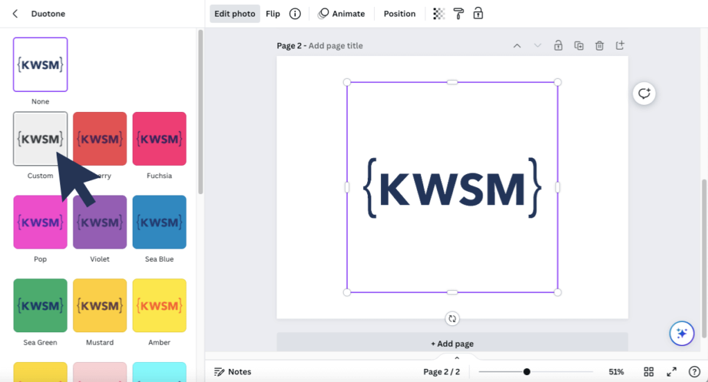
How to Change the Color of a Logo or Element in Canva
This is one tip I wish I knew a lot sooner in my journey using Canva. Maybe you’re in a situation where you only have your logo in one color but you really want to change it to another color in your brand kit. Canva has a solution. Select the logo > edit image > duotone > select a color or click into one and adjust the highlights and shadows for a custom shade.
Tips for Saving Time in Canva
Hopefully, the elements of design and Canva tips we have discussed so far have you feeling like a pro, or at least more confident in creating content. Let’s level up with a few shortcuts that are going to save you time when building designs.
Grouping Elements
If you want to move more than one element at once, hold shift and select each element that you would like to group, or click and drag your mouse over the items you would like to group. Now you can move multiple items across your design at once or apply an animation to multiple elements at once.
Using the Paint Roller Tool
This tool is also a huge time saver. If you have a group of text that you want to match in style, font, size, and color, use the paint roller tool. Select the text you want to copy > click the paint roller tool > click the text you want to change.
Moving an Element that is Underneath Another Element
Designing in Canva involves working with many layers, so you may find yourself in a position where you need to move an element that is underneath another layer. Holding the ‘Command’ key will allow you to select that element.
Interested In What a Digital Marketing Team Can Do for Your Business?
If you are interested in what a digital marketing team composed of professionals in graphic design and content creation can do for your business, fill out the form below to get in touch.