Optimizing web accessibility is not just best practice; it’s a pathway to an inclusive, positive online experience for all visitors by ensuring it’s comfortable and navigable for those with disabilities. As a dedicated Web Designer at KWSM, I’ve integrated ADA Accessibility standards into our web design process to ensure your website serves a diverse audience.
The internet is for everyone, and ensuring your website is accessible is more than a legal mandate—it’s just the right thing to do. In this post, I go over five methods a web design agency can implement to improve website accessibility.
What Is Website Accessibility?
Website accessibility refers to tools and technologies that are designed and developed so that people with disabilities can use them. This includes ensuring that those with impaired vision, hearing, motor skills, or cognitive disabilities can navigate, understand, and interact with your web content. When your website is designed and developed with accessibility in mind, all users have equal access to the same information and functionality.
With these five steps, your website will make strides toward providing an accessible experience.
1. Use High-Contrast Colors
If the color of text on a web page is too close to the color of the background—too dark, too light, or too similar in hue—the resulting low contrast between text and background can make the text very hard to read, while other times opacity levels can be too low between foreground and background elements making text appear faded or blurry.
High-contrast text and other elements will make copy more legible and UI easier to navigate, which helps users find what they are looking for faster.
Example: Black text on a navy blue background tends to have low contrast. While white text contrasts with a navy blue background much better.

A quick and easy way to check whether you are using a combination of highly contrasting colors is to use the WebAIM Contrast Checker.
2. Add Alt Text to Images
Users with screen readers often rely on alt text to interpret the content of on-screen images, so adding an accurate description for the image’s alt tag. Thoroughly describe the image in the alt text and use the keywords related to the web page to give the user context about why the image is used.
If the image contains vital information, include that copy in the alt text. Here’s what KWSM’s Senior Web Developer, Angie Smith, had to say about alt text:
“Not only is alt text necessary for accessibility, it can play a big role in the SEO on your website. Since Google uses alt text to understand the subject matter of the image, it’s important to include the keyword you’re trying to target for that specific page. And as an added bonus, using alt text can help land an image from your website in a Google image search, further boosting your SEO.”
– Angie Smith, Senior Web Developer, KWSM: a digital marketing agency
3. Add Aria-Labels to Links
Aria-labels added to any links that don’t include on-the-page visibility make it possible for users—including those with screen readers—to know exactly where those links will lead.
Examples of this include:
- Linked text in the main copy of the web page
- Linked images
- Linked titles
- Linked names
- Linked icons
If link text is visible, the aria-label should include the exact phrase that is visible, along with an instruction such as “click here.”
Example:
<a href=”#link” aria-label=” Click Here to Read More About How to Improve Website Accessibility”>Read More About How to Improve Website Accessibility</a>
In the example above, “Read More About How to Improve Website Accessibility” is the link displayed on the page, but the aria-label text is “Click Here to Read More About How to Improve Website Accessibility” which describes a little more to a screen reader and provides the “click here” instruction to the user.
4. Display Fonts in REM Instead of PX
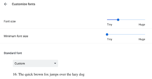
Font sizes are usually set in pixels (PX) on a web page, but pixels can make it difficult for users with screen readers to adjust the size of the text in their web browser. Switching the font display settings on your website to be set in root-em (REM) format instead of PX format allows a user to scale the text size as needed on a website.
REM determines an element’s size compared to the “root” element. For most browsers, the default or “root” text size is 16PX, so setting the rest of your fonts to display in REM will adjust the font size in direct proportion to that root text size of 16PX.
1REM = 16PX
2REM = 32PX
3REM = 48PX
This way, if a user changes the default font size of their browser, the typography set in the REM format will automatically adjust to accommodate this change. For example, if the default “root” size has been changed to 20px, headings set at 3REM would adjust to display at 60px, tripling the default font size.

This setting is particularly simple to accomplish with the Elementor page builder in the font display settings.
Related post: Elementor Benefits for Clients & Developers
Improve Website Accessibility with the Google Insights Accessibility Score

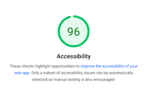
Google provides a free tool to help improve website accessibility. You can copy and paste the URL of any web page into the Page Speed Insights test provided by Google and get an ADA Accessibility score along with a list of suggested accessibility improvements. This can be a great starting point for areas to address first on your website, and you can hire a web design agency to help you implement the changes on this list.
Looking For a Comprehensive Audit of Your Current Page to Improve Website Accessibility?
Our team does a thorough website audit that encompasses design, SEO optimization, mobile-first design, and accessibility best practices. Fill out the form below to inquire about a website audit and learn about our web design services.

