
Did you know mobile devices account for over half of all internet traffic globally? This has led to a significant shift in how we consume information and interact with websites. Whether they’re browsing, shopping, connecting with loved ones, or managing daily tasks, more and more people turn to their phones and tablets, making mobile optimization an absolute necessity to keep up with your competition.
What is a Mobile-First Design Strategy?
A mobile-first approach means designing your website for mobile devices first and then scaling it up for desktop computer screens. This approach isn’t just a trend; it’s a response to the growing popularity of mobile browsing. Neglecting mobile optimization doesn’t just put you at a disadvantage; it can actively drive away the growing demographic of mobile-only internet users.
Enhancing User Experience and Search Visibility
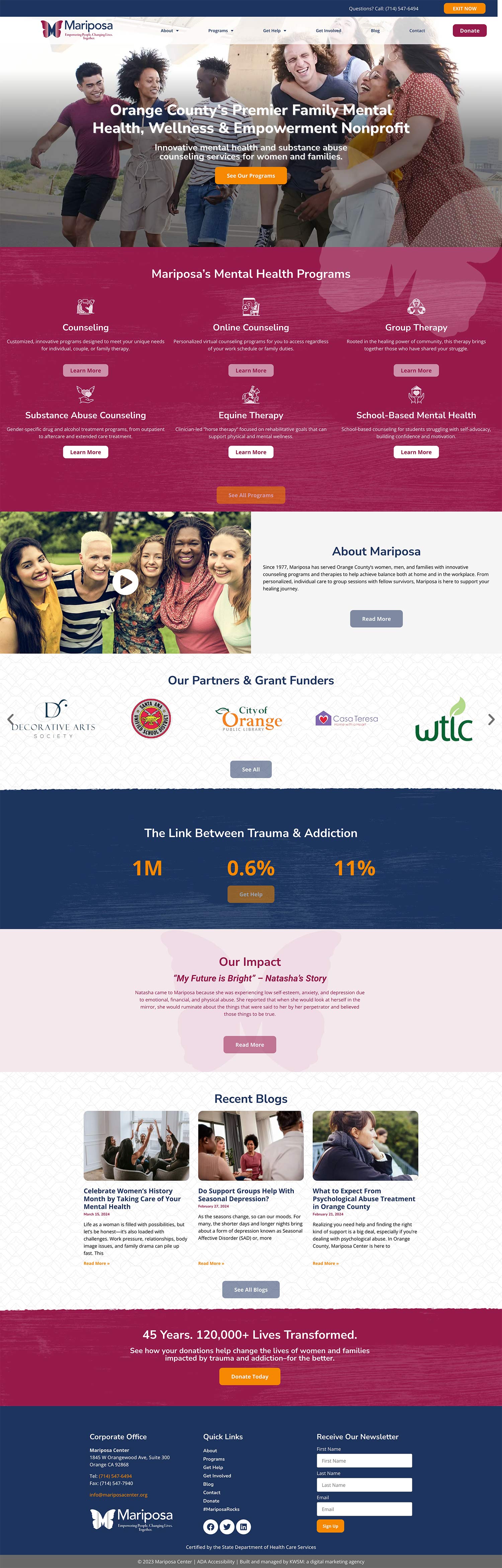
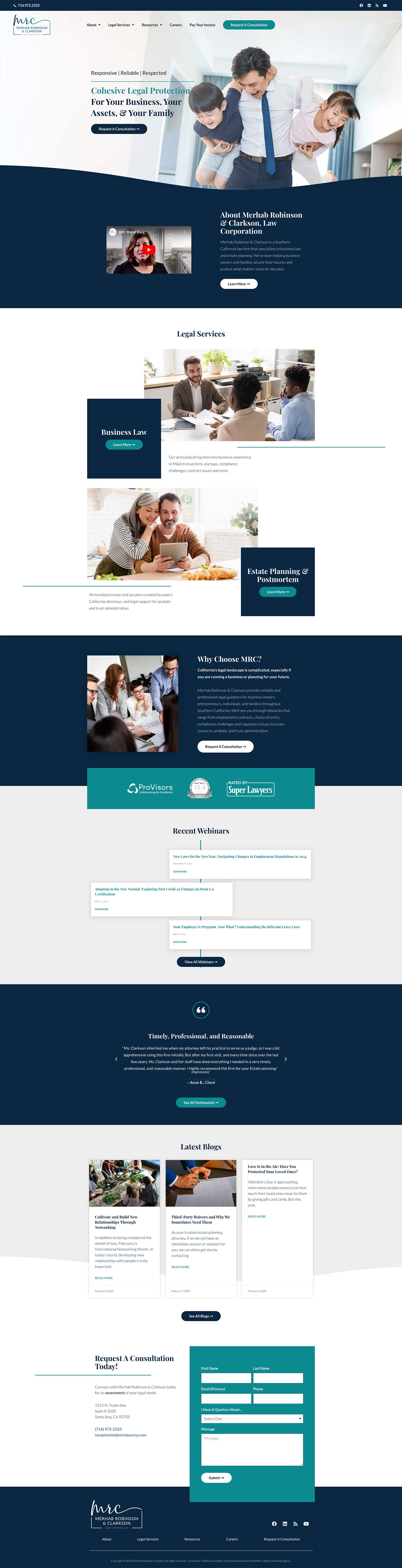
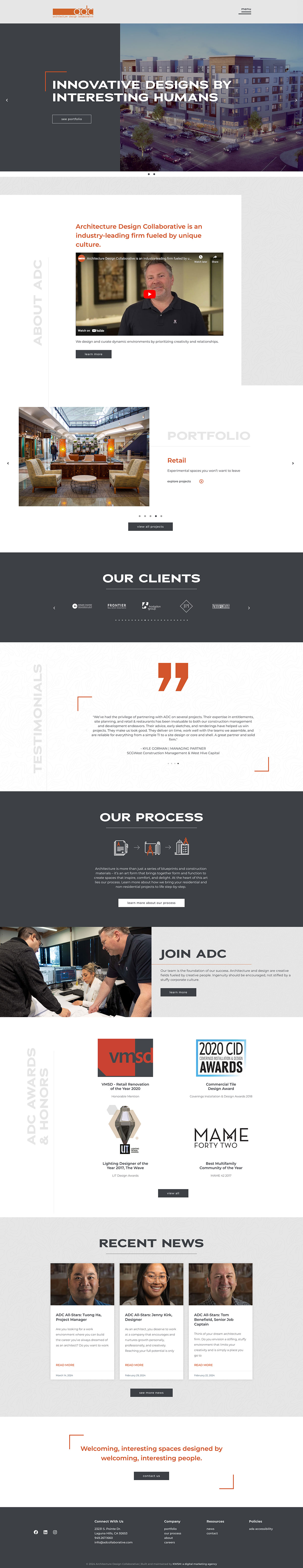
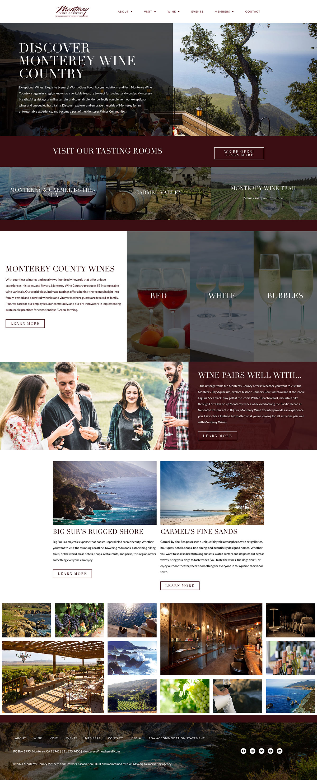
Mobile-first website design services are designed to cater to the constraints of mobile devices, such as reduced screen real estate and potentially slower internet speeds. This focus on optimization translates to quicker load times and smoother navigation, directly contributing to an optimized user experience. Additionally, search engines like Google now prioritize mobile-friendly sites, making mobile optimization a critical factor in your website’s search rankings and, by extension, its ability to attract and convert traffic.
Related Article: 9 Steps to Optimize Your Website’s User Experience
Future-Proof Your Website
Mobile devices are likely to become even more prevalent as technology continues to evolve. Embracing a mobile-centric approach ensures your site remains ahead of the curve, protecting its relevance as new browsing habits emerge and technology marches forward. This foresight in design is your blueprint for a digital presence that stands the test of time and technological trends.
Partner with KWSM to Give Your Website a Mobile-First Design
Incorporating a mobile-first design is a strategic move that enhances the user experience, boosts your search rankings, and secures your site’s relevance well into the future. If your website isn’t already optimized for the mobile audience, it’s time to get started with a web design agency.
At KWSM, our decade-plus experience in crafting mobile-first websites positions us as your ideal partner in this mobile-centric world. We’ve constructed hundreds of sites that not only captivate visually but also excel in functionality. Our websites focus on user experience and are tailored for the mobile user.
Ready to revolutionize your web presence? Fill out the form below to begin the to chat about your existing site, or create a new web experience.
